This redesign project focused on transforming a local neighborhood record store’s outdated e-commerce website and mobile app into a more intuitive, engaging, and user-friendly digital experience. The goal was to preserve the store’s unique community-driven identity while improving how customers discover, explore, and purchase music online.
Through user research, competitive analysis, information architecture, wireframing, prototyping, and usability testing, the redesign addressed key pain points including difficult navigation, limited product discovery, outdated purchasing flows, and a lack of personalized experiences. The updated solution focused on creating a seamless browsing experience, easier album discovery, improved search functionality, streamlined checkout, and stronger connections between the physical store and digital community.
By combining thoughtful UX strategy with the personality and culture of a local record shop, the redesign created a modern digital platform that improved usability while maintaining the authentic experience that makes independent music stores unique.
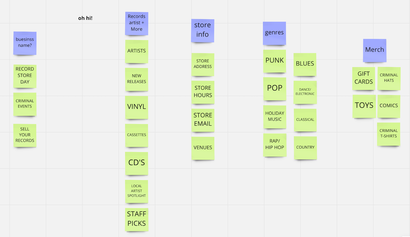
To create a more intuitive shopping experience for the record store’s updated e-commerce website and mobile app, I conducted card sorting exercises to understand how users naturally organize and categorize music content. The goal was to uncover the simplest, most familiar navigation structure based on how customers think about browsing, discovering, and purchasing records.
Participants were asked to group and label categories such as genres, artists, formats, new releases, collections, and store features. Their responses helped identify common patterns, eliminate confusing terminology, and reveal opportunities to improve the site’s information architecture.
The insights gathered from card sorting directly informed the navigation system, category structure, and content organization for the redesign. By aligning the digital experience with users’ mental models, the updated platform made it easier for customers to find music, explore new artists, and enjoy a more seamless connection to the record store’s community and brand.
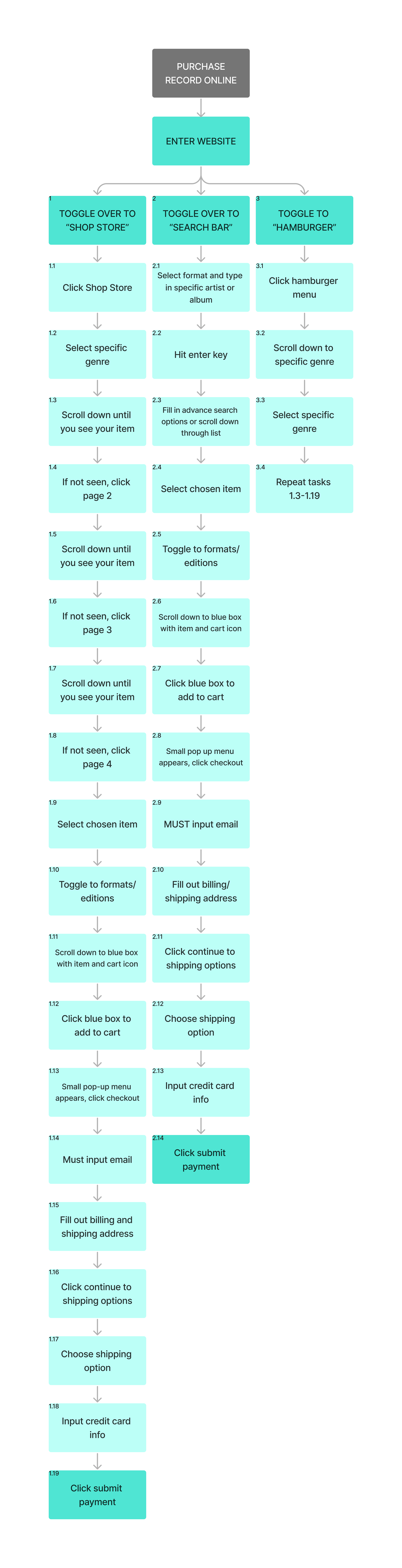
THE IMAGE TO THE LEFT IS THE BEFORE TASK ANALYSIS TO CHECKOUT FOR A PURCHASE.
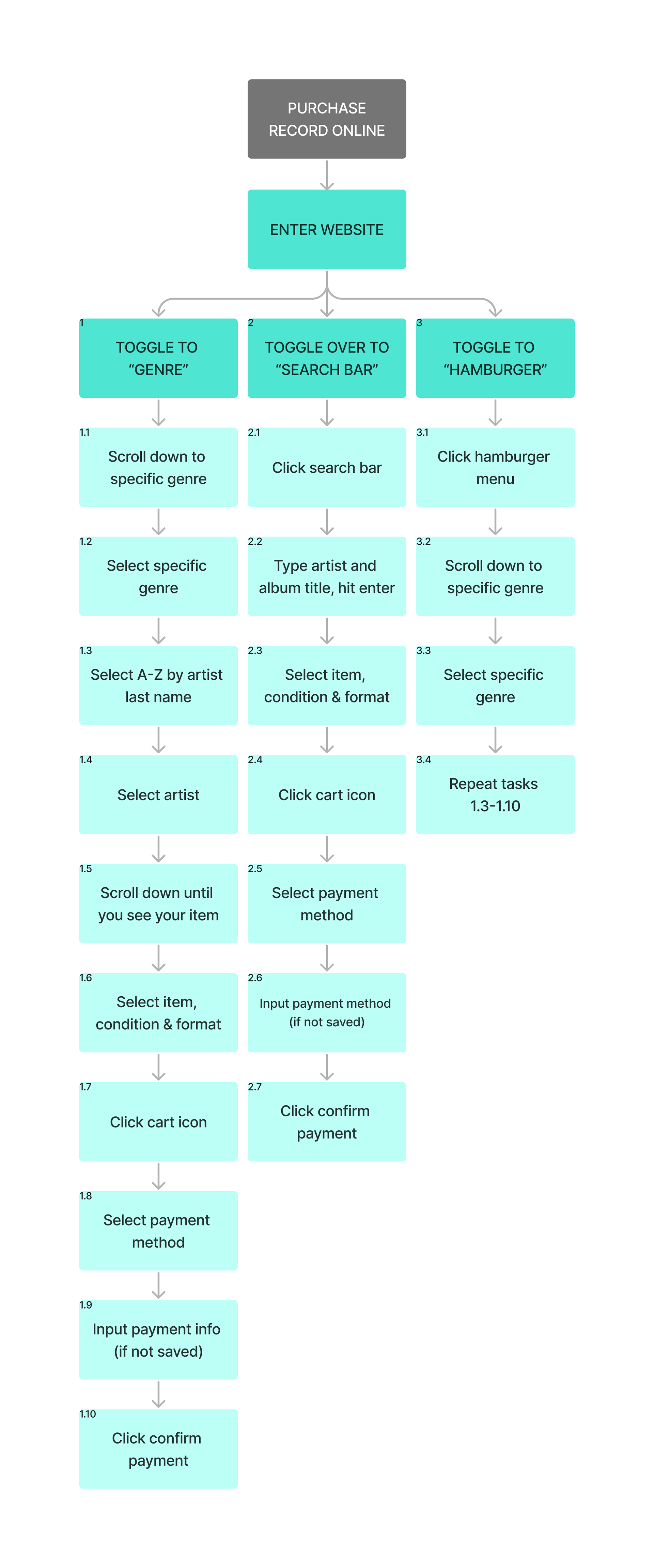
THE IMAGE TO THE RIGHT IS THE AFTER TASK ANALYSIS TO CHECKOUT FOR A PURCHASE.
I CREATED A MUCH SIMPLIFIED, USER FRIENDLY VERSION AFTER MANY ROUNDS OF USER TESTING.
To bring the record store’s mobile e-commerce experience to life, I created an interactive prototype that allowed users to experience key shopping flows before development. Using rapid UI design and iterative testing, the prototype focused on making common tasks—such as discovering new music, searching for albums, browsing categories, viewing product details, adding items to a cart, and completing checkout—simple and intuitive.
Through user testing, I observed how customers navigated the app, identified areas of confusion, and gathered feedback on functionality, layout, and overall usability. These insights helped refine the interface, improve navigation, and streamline the purchasing journey.
The rapid prototyping and testing process allowed design decisions to be validated early, ensuring the final mobile app delivered a seamless shopping experience while maintaining the personality, discovery, and community feel of a local record store.