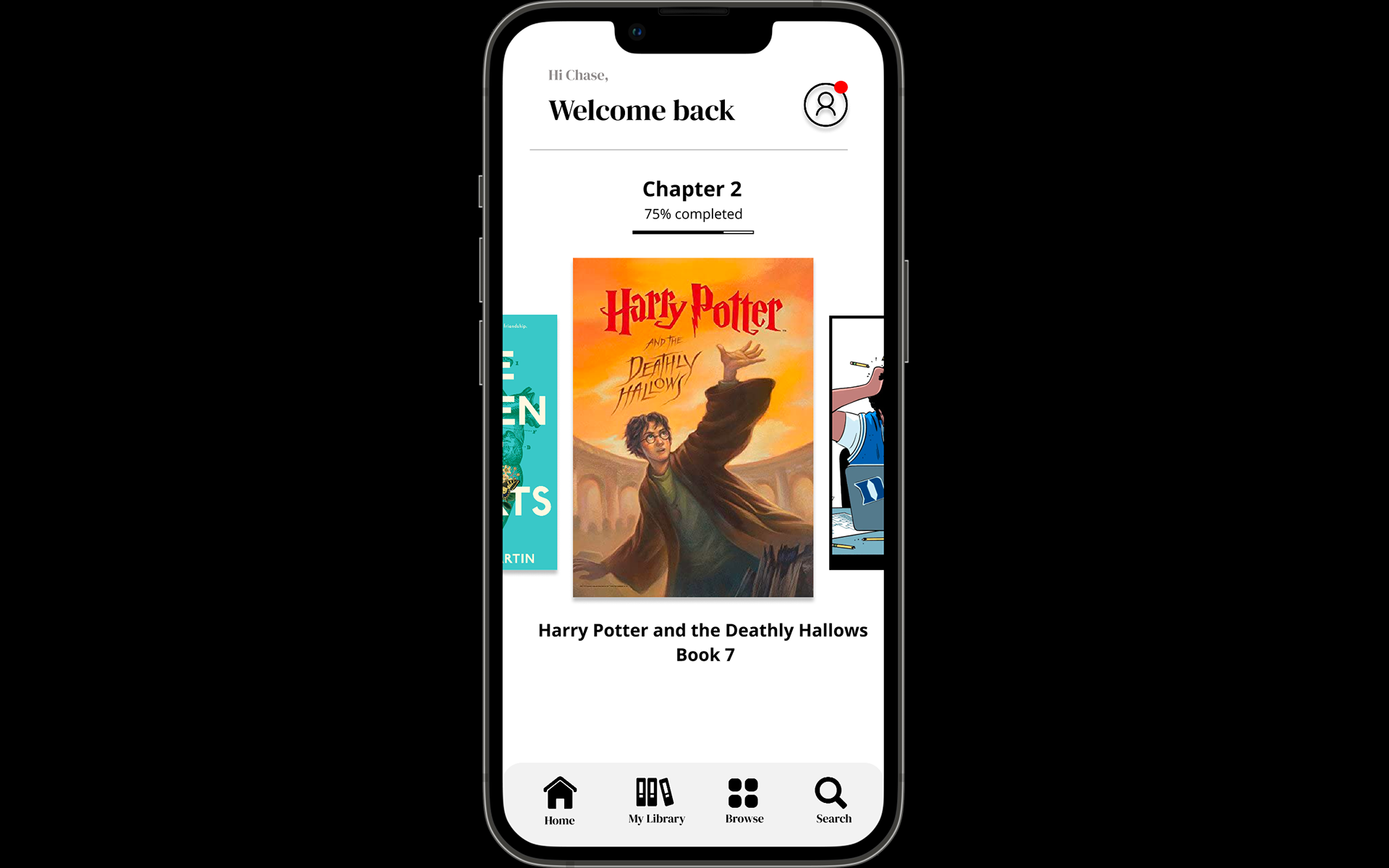
Designing a seamless reading experience, wherever life happens.
BOOKMARK is a mobile application designed for people who read on the go, making it easy to save their place across books, articles, documents, and other reading materials without disrupting their routine.
This project focused on understanding user behaviors through research, interviews, and usability testing to uncover the challenges readers face when switching between physical and digital content. Insights gathered throughout the discovery phase informed a user-centered experience that prioritized speed, simplicity, and accessibility.
From information architecture and user flows to wireframes, visual design, branding, and logo development, every decision was guided by user feedback and iterative testing. The result is an intuitive mobile experience that minimizes friction, reduces cognitive load, and helps users return to their content effortlessly—whether they're commuting, studying, or reading between DAILY MOMENTS.
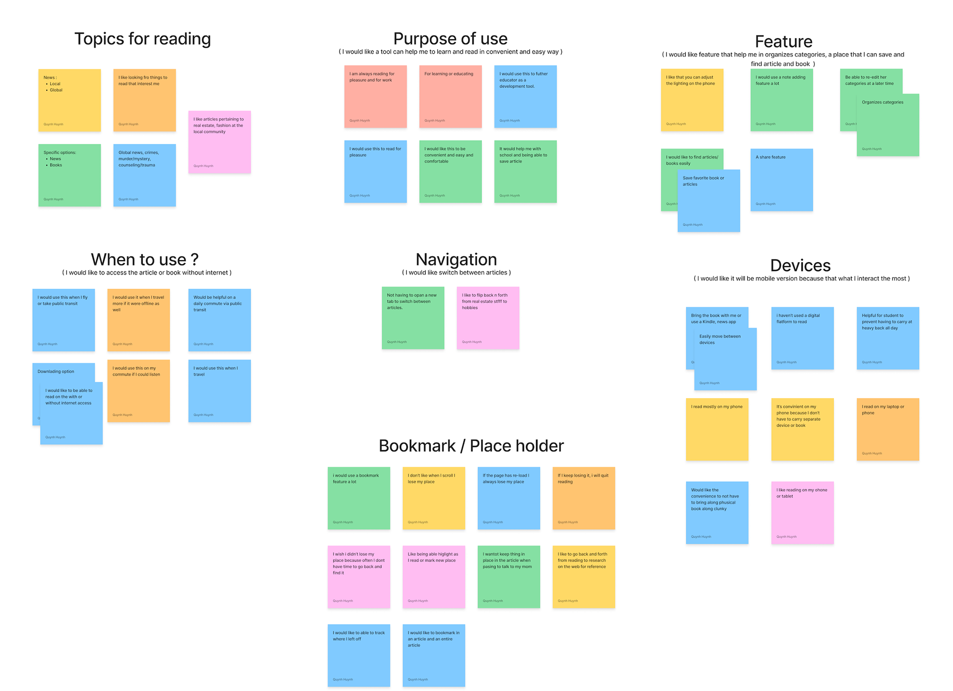
Following user interviews and usability research, an affinity mapping exercise was used to organize qualitative data into meaningful themes. Quotes, observations, pain points, and behavioral patterns were grouped to identify common user needs and uncover opportunities for improvement.
For BOOKMARK, the affinity map revealed recurring frustrations around losing reading progress, switching between physical and digital materials, and relying on inconsistent methods like screenshots, folded pages, or notes to remember where users left off. Additional themes highlighted the importance of speed, simplicity, and minimizing interruptions while reading on the go.
These insights established clear design priorities and informed key product decisions, including streamlined navigation, intuitive bookmarking interactions, and a lightweight user flow that allows readers to save and resume their place in seconds. Affinity mapping ensured every design decision was grounded in real user behavior, resulting in a more intuitive and user-centered mobile experience
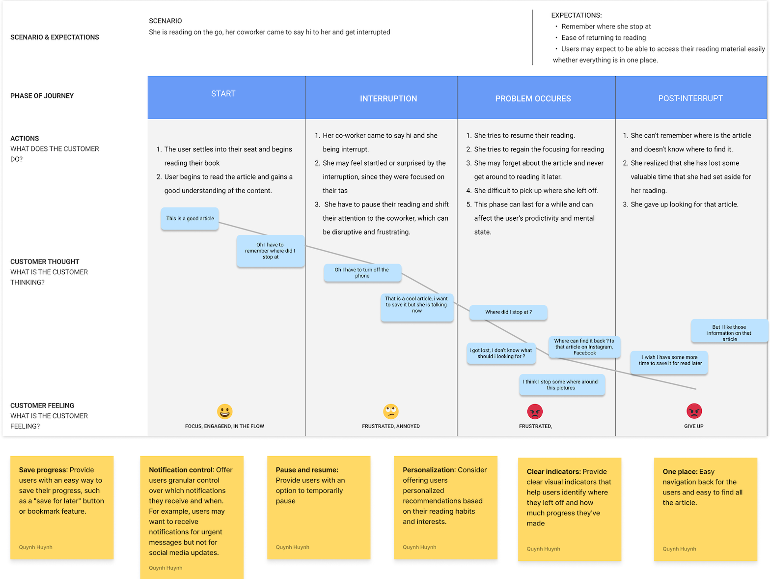
A journey map was created to visualize the end-to-end experience of readers as they moved between different environments, devices, and reading materials throughout their day. Mapping each touchpoint helped identify moments of friction, user goals, emotions, and opportunities to create a more seamless experience.
For BOOKMARK, the journey revealed that users often interrupted their reading while commuting, studying, working, or multitasking, making it easy to lose their place or forget where they left off. Existing solutions—such as folded pages, screenshots, sticky notes, or phone reminders—were inconsistent and disrupted the reading experience.
These insights guided the design of a streamlined workflow that enables users to quickly save their place and effortlessly return to their content later. By understanding the user's journey from discovery to resuming a reading session, the final experience was designed to reduce cognitive load, eliminate unnecessary steps, and support readers whenever and wherever they choose to read.
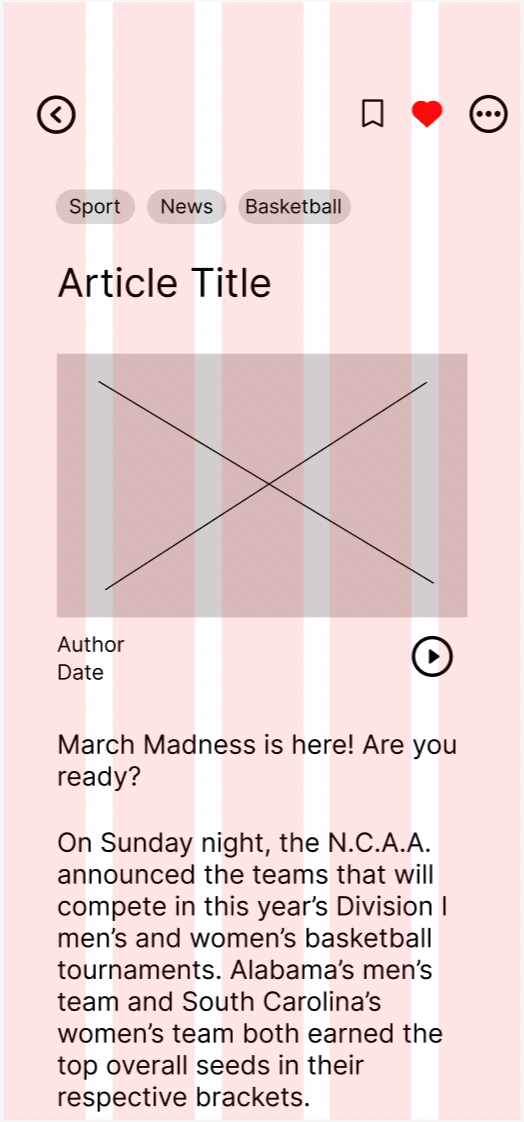
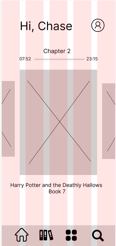
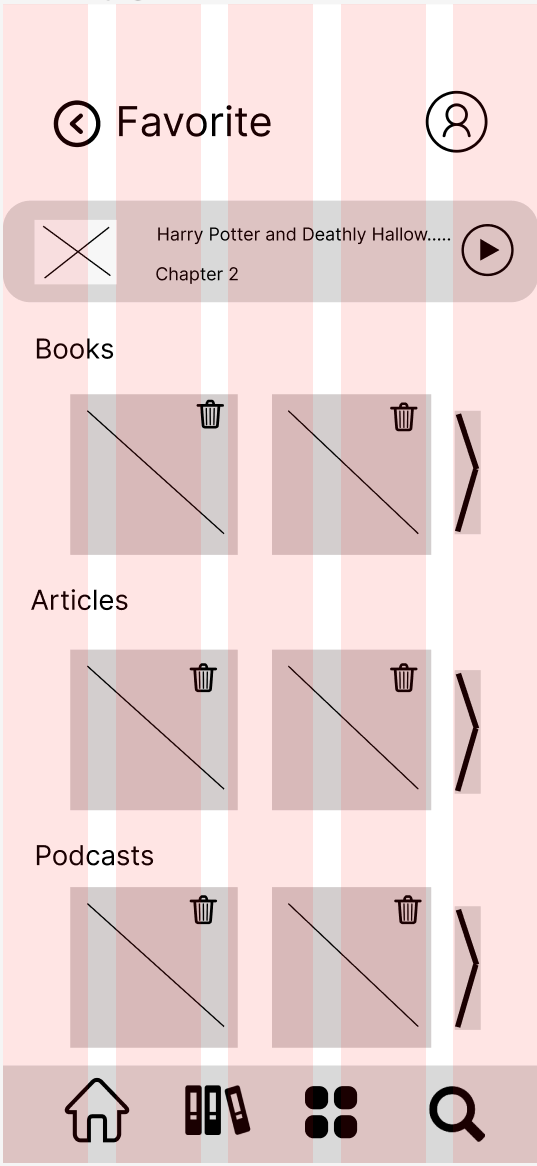
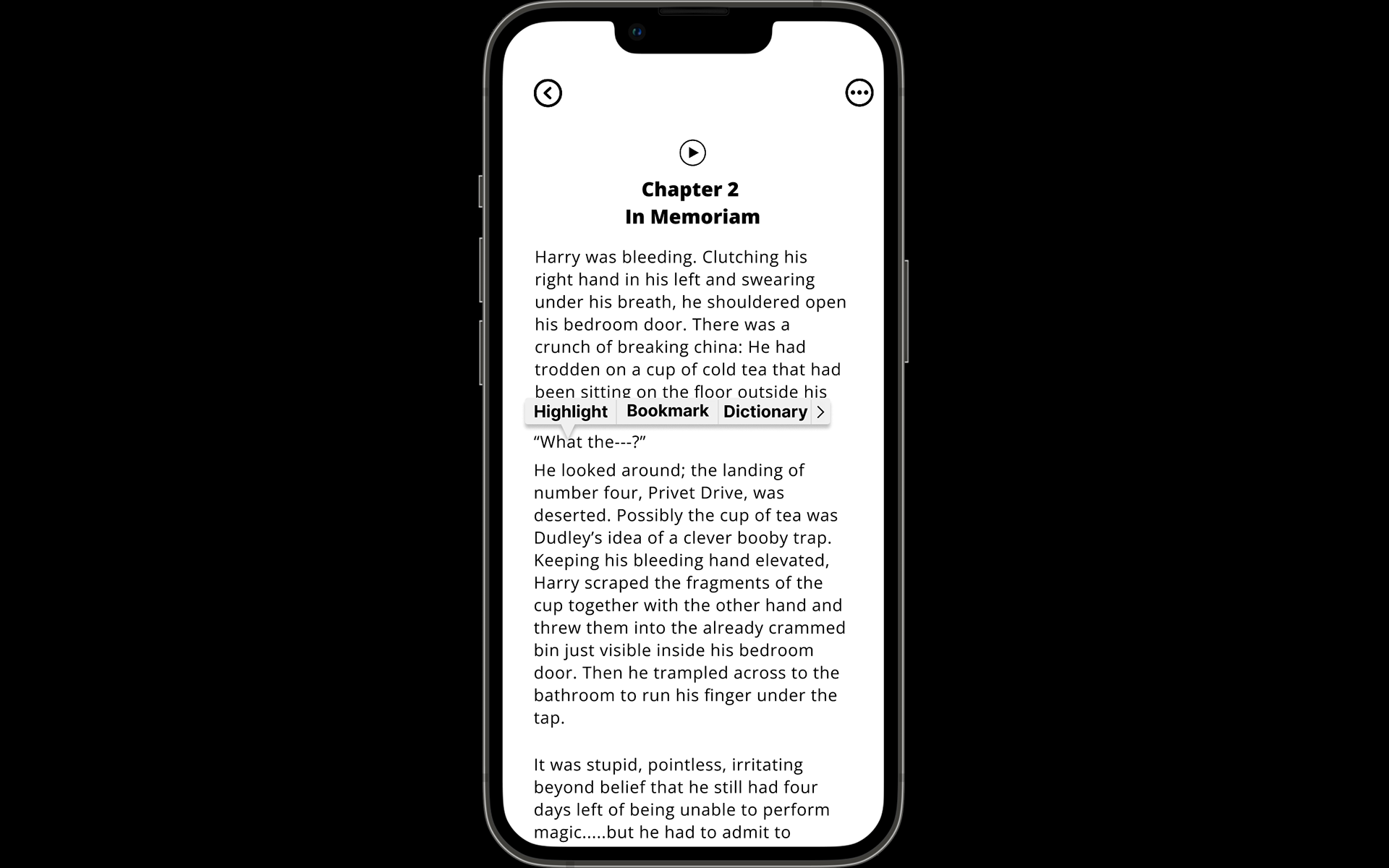
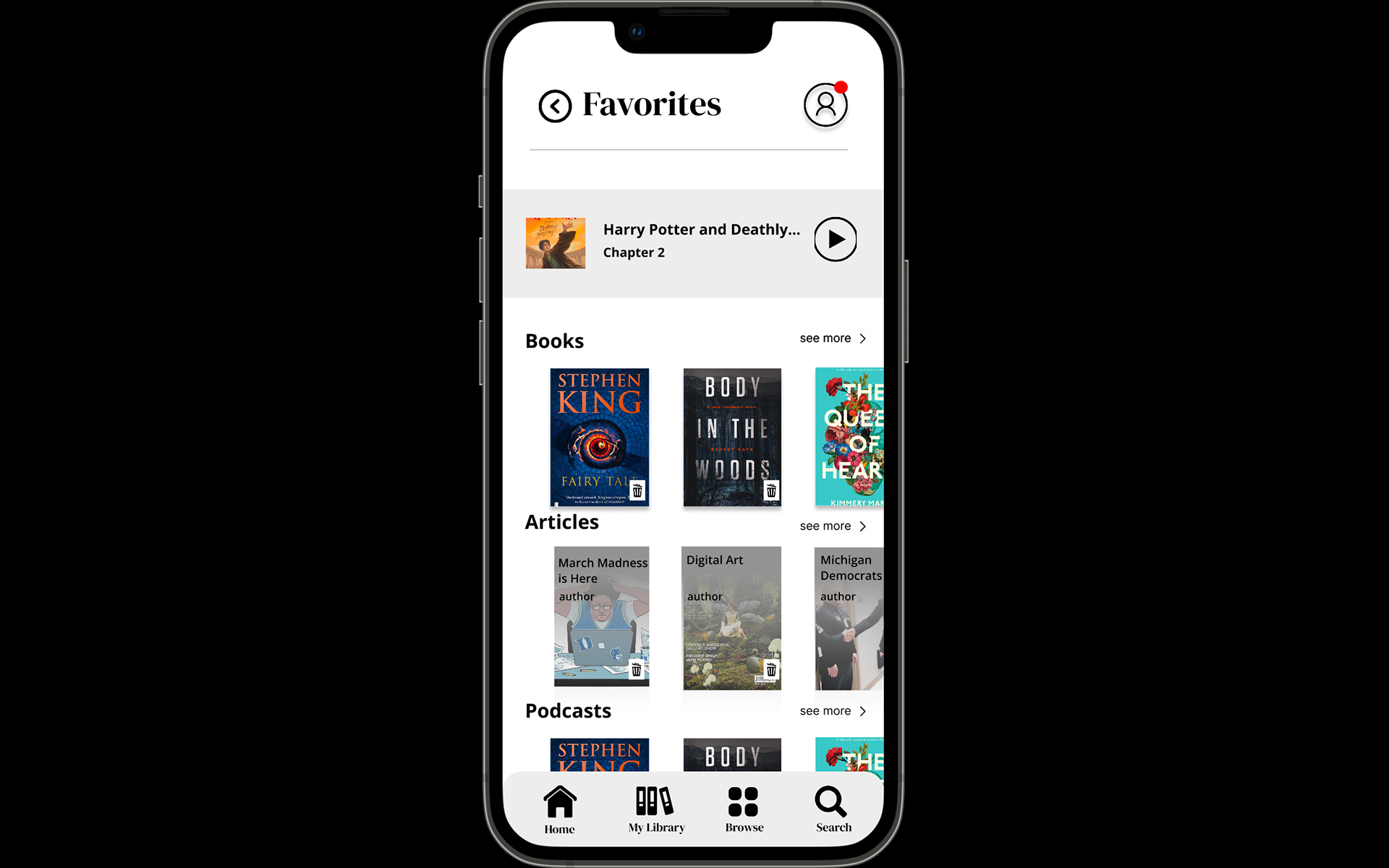
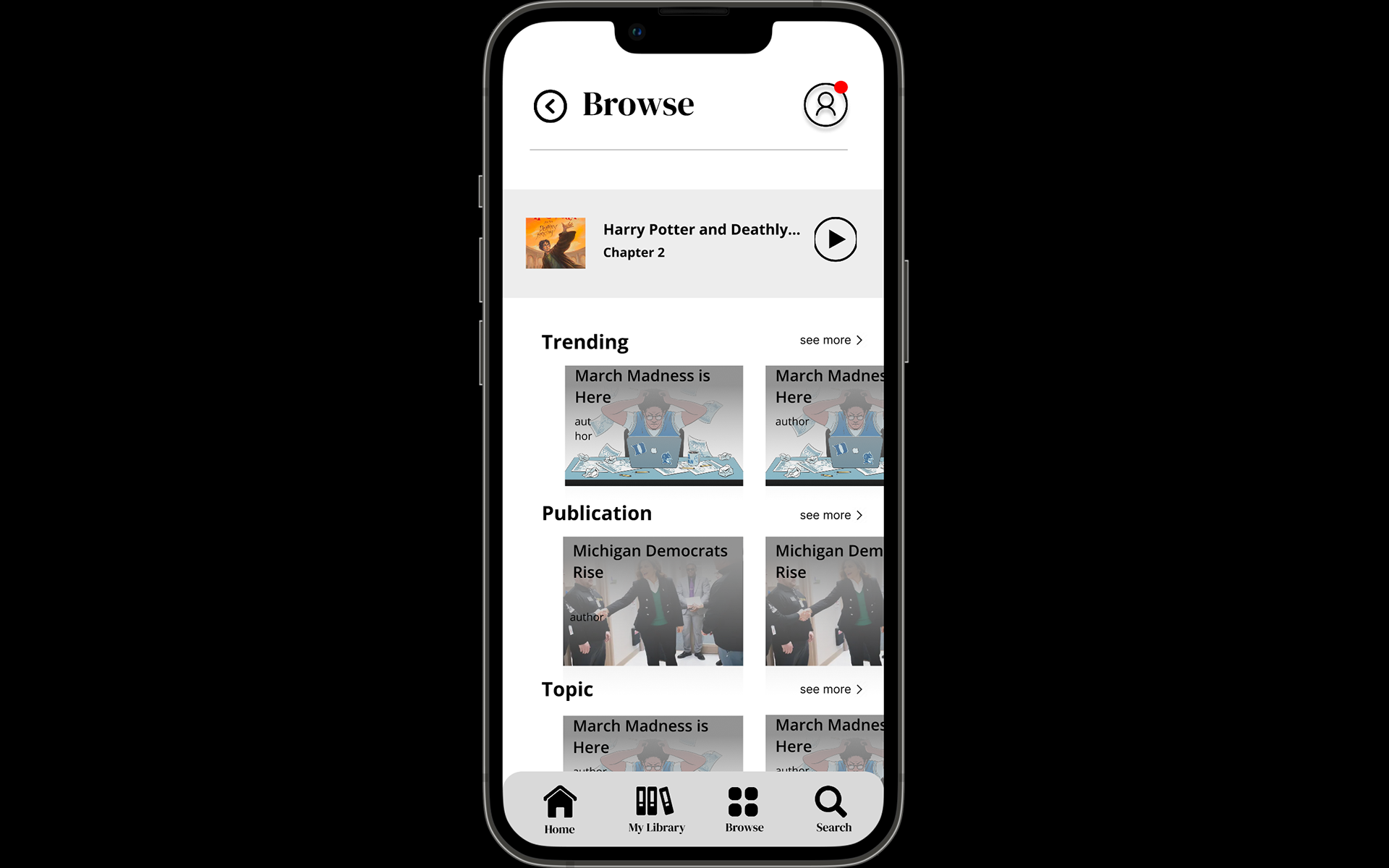
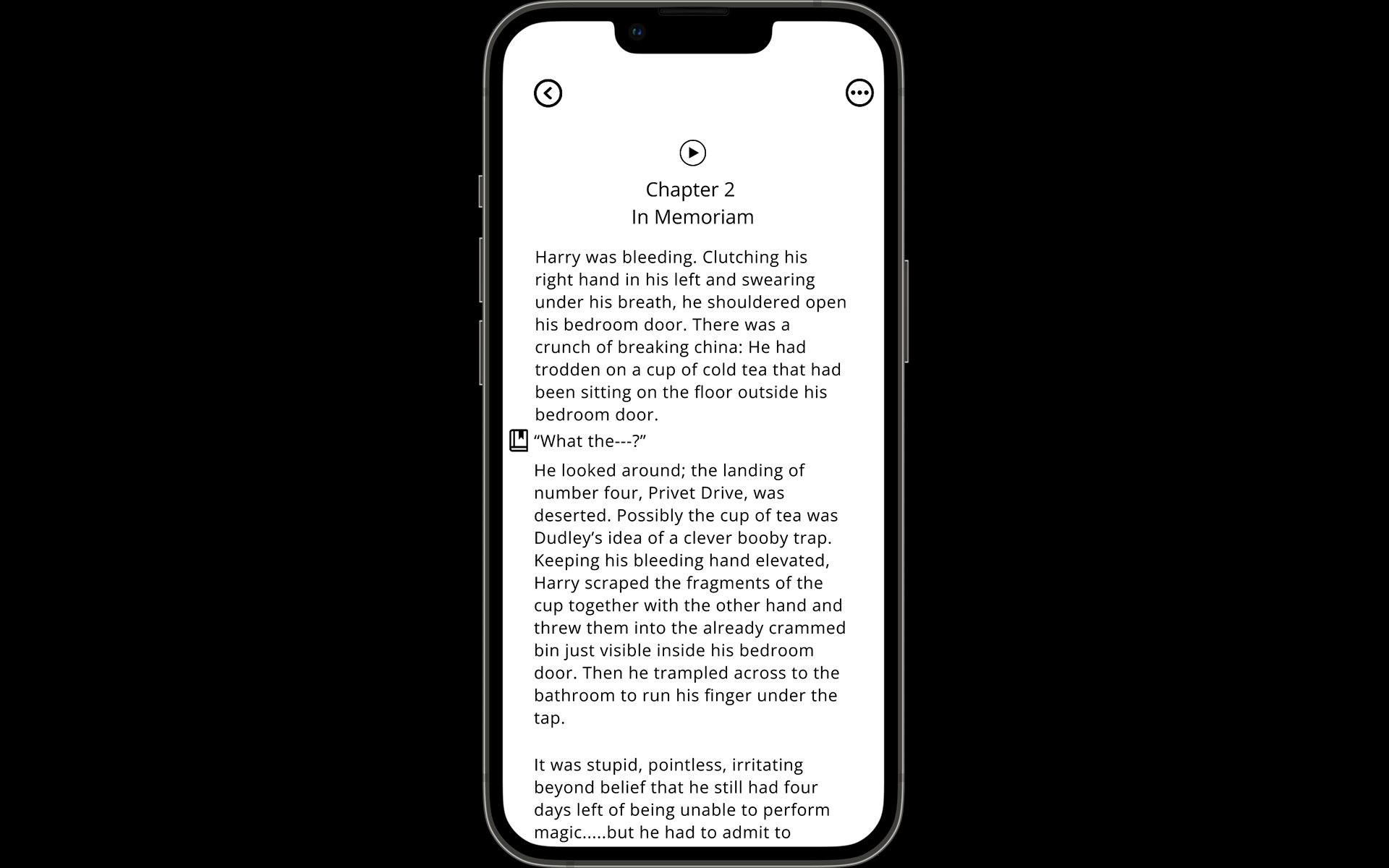
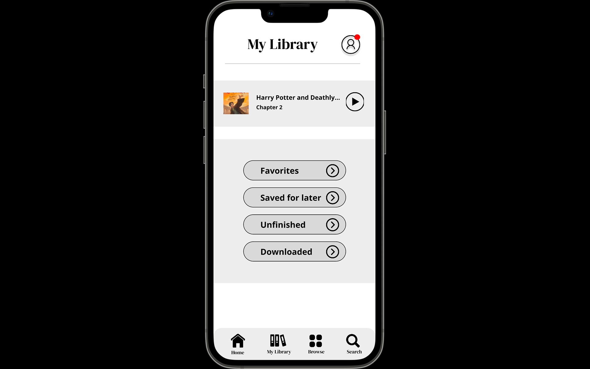
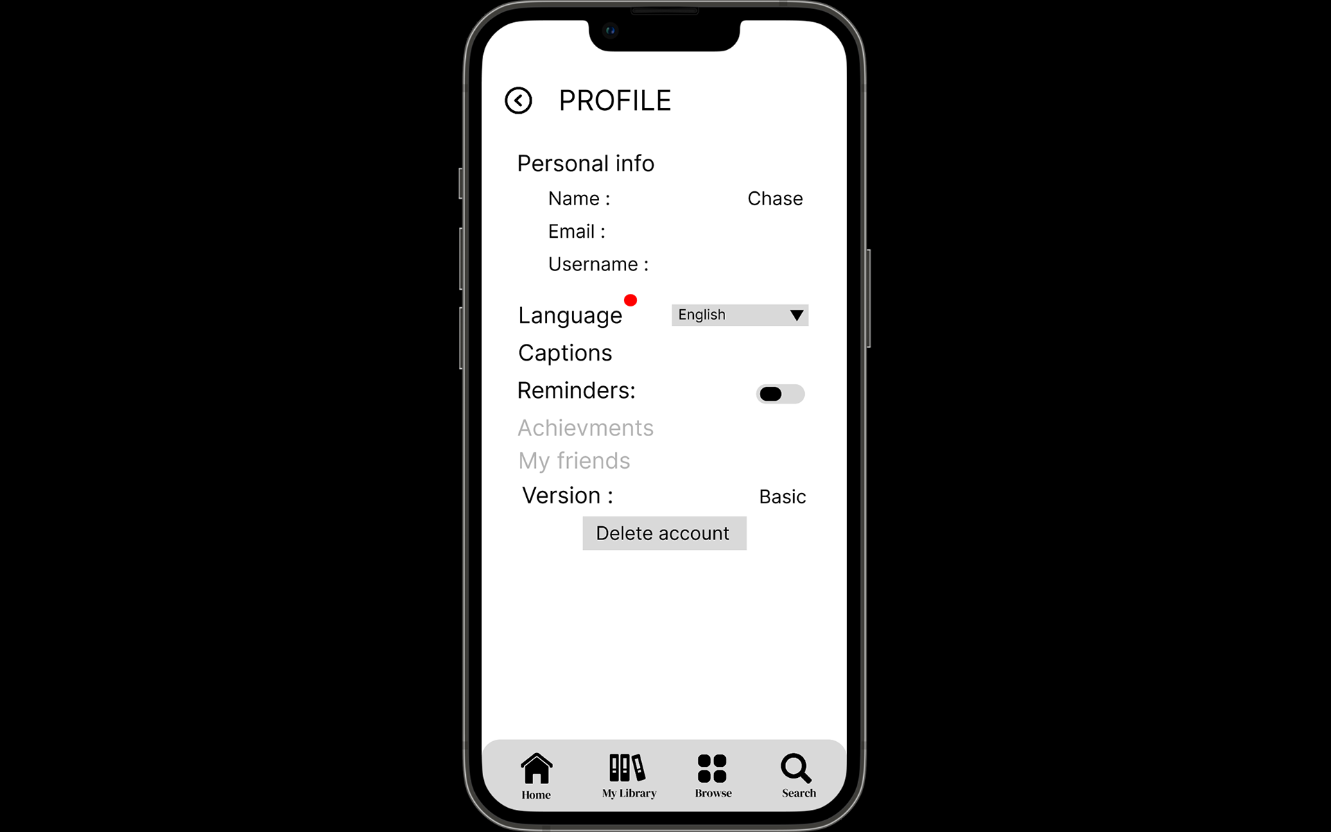
Wireframes were developed to translate research insights into a clear, user-centered interface focused on simplicity and efficiency. Low-fidelity layouts allowed for rapid exploration of navigation, content hierarchy, and user flows before investing in visual design.
For BOOKMARK, wireframing prioritized the core task of saving and returning to reading progress with as few interactions as possible. Multiple iterations were tested to refine screen layouts, improve discoverability, and reduce cognitive load, ensuring users could quickly bookmark their place whether reading a physical book, digital article, or document.
The wireframing process established the foundation for usability testing, enabling design decisions to be validated early and refined through user feedback. This iterative approach ensured the final interface was intuitive, accessible, and aligned with the needs identified during the research phase.