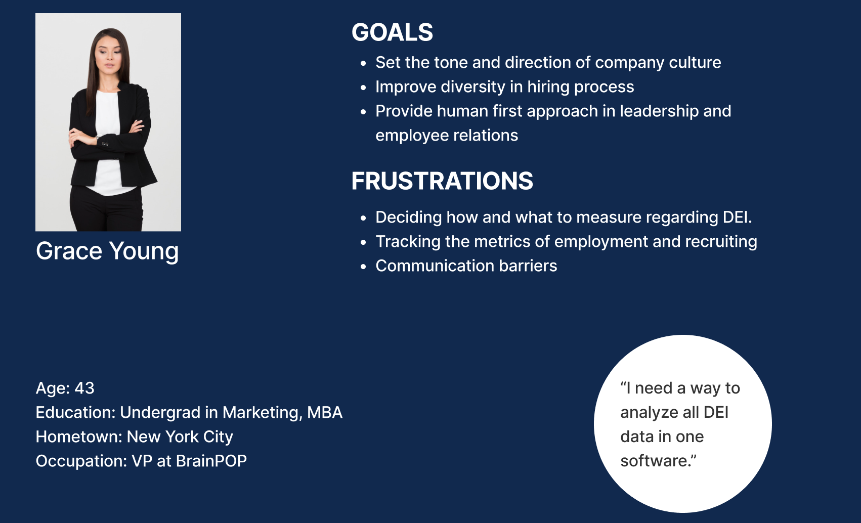
To design an effective DEI (Diversity, Equity, and Inclusion) analytics tool, I developed user personas to better understand the needs, goals, and challenges of the people interacting with employee journey data. Personas represented key stakeholders—such as HR leaders, hiring managers, and organizational decision-makers—who rely on accurate insights to understand an employee’s experience from recruitment and onboarding through career growth, retention, and offboarding.
Through research and analysis, personas helped identify critical needs such as tracking equitable hiring practices, monitoring employee advancement opportunities, recognizing retention trends, and uncovering potential gaps in the employee experience. By understanding how different users access and interpret workforce data, the design could prioritize clarity, accessibility, and actionable insights.
These personas guided the development of the DEI analytics platform by ensuring that dashboards, reporting tools, and data visualizations were designed around real user goals—helping organizations make informed decisions, improve employee experiences, and create more equitable workplace environments.
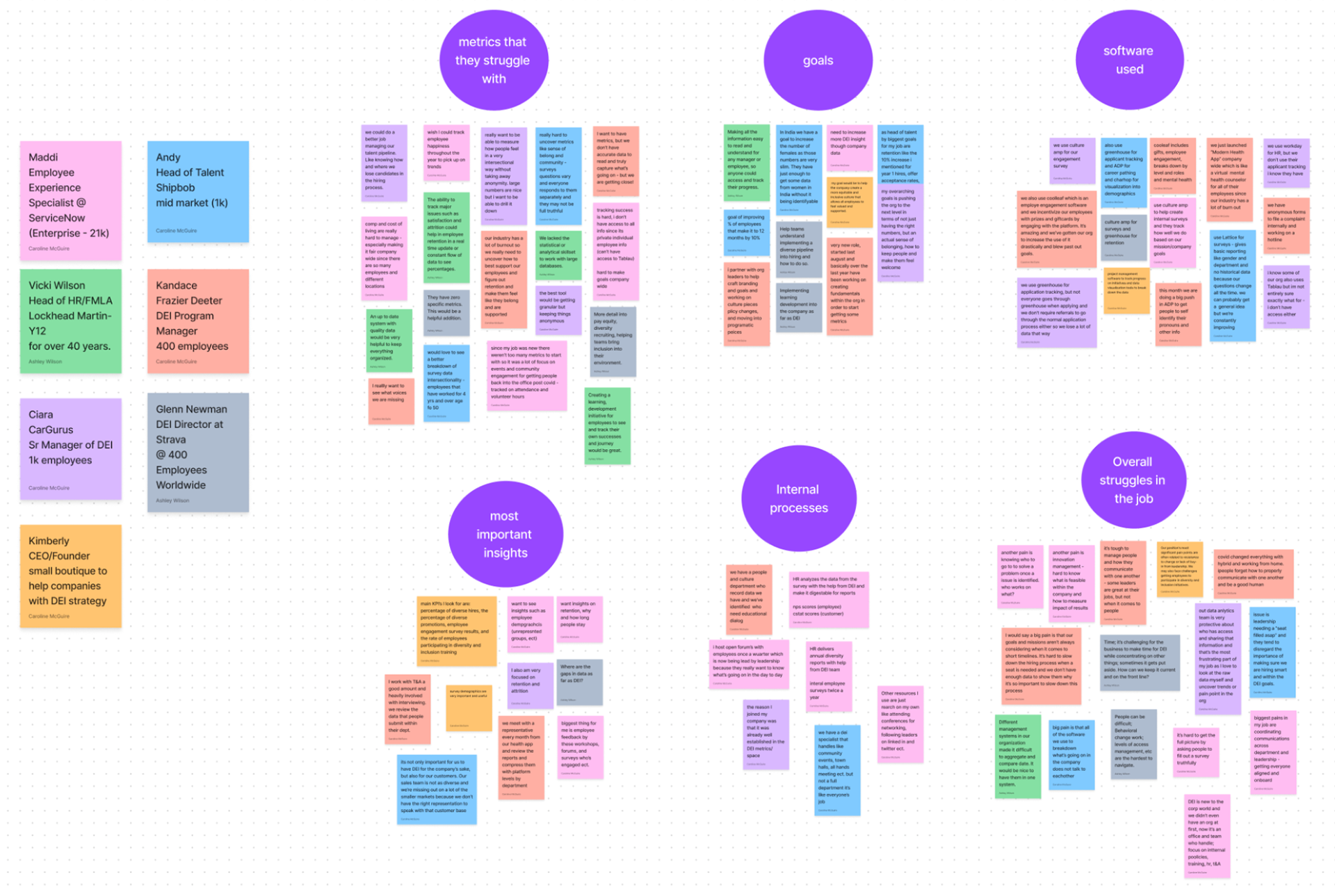
To better understand the challenges and opportunities within an employee’s lifecycle, I created an affinity map to organize research insights for a DEI analytics tool. By gathering findings from stakeholder interviews, user research, and competitive analysis, I grouped common themes around the employee journey—from recruitment and interviews through hiring, onboarding, career development, retention, promotions, and offboarding.
The affinity mapping process helped identify patterns in how organizations collect, analyze, and act on workforce data. Key themes emerged around equitable hiring practices, employee growth opportunities, representation, engagement, retention trends, and identifying potential barriers throughout the employee experience.
These insights helped define the platform’s core functionality, informing dashboard structures, data tracking needs, reporting features, and user workflows. By transforming complex research findings into clear themes, the affinity map ensured the DEI analytics tool was designed to provide meaningful insights, support data-driven decisions, and help organizations create more inclusive employee experiences.
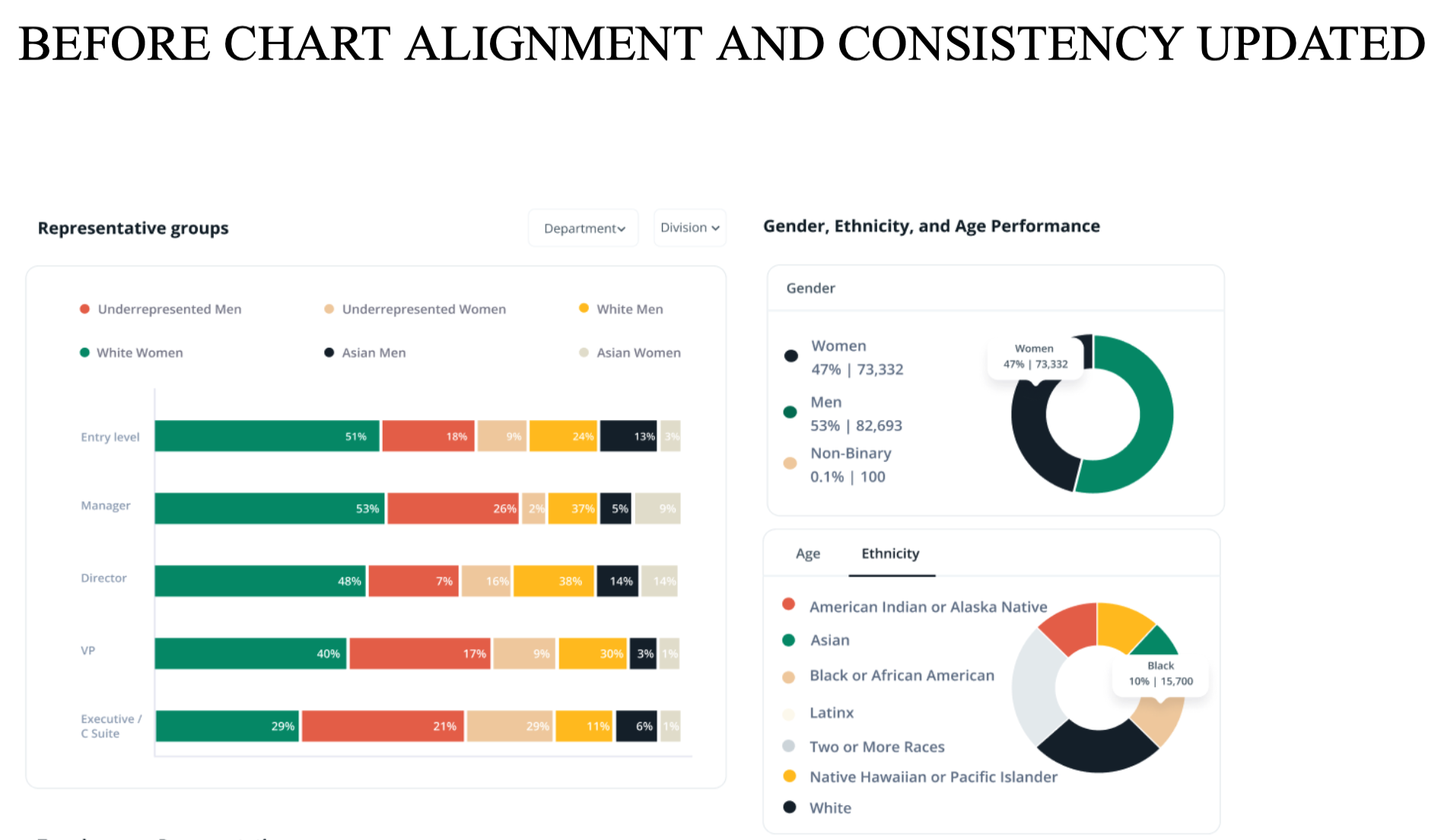
FIRST IMAGE IS BEFORE THE RE-DESIGN OF A MORE USER FRIENDLY HOME PAGE FOR ILLOOMINUS.
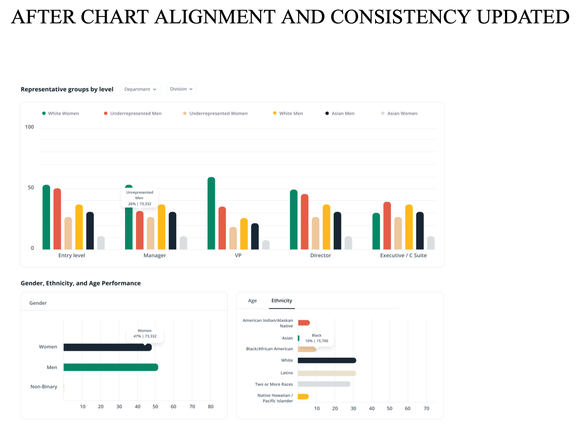
THE SECOND IMAGE IS AFTER THE RE-DESIGN TO MAKE NAVIGATION AND UNDERSTANDING MORE FRIENDLY TO ANY USER. MORE RELATABLE WAYS TO UNDERSTAND AND READ DATA ANALYTICS FOR EMPLOYERS.
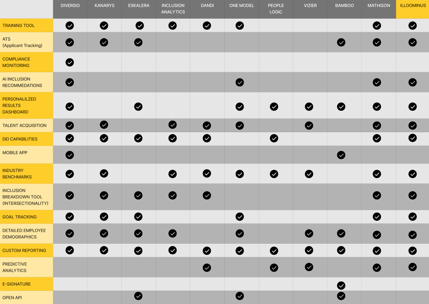
To identify opportunities for innovation within the DEI analytics space, I created a feature inventory chart to evaluate existing workforce analytics platforms and compare how competitors track and visualize the employee journey. The research focused on key stages of the employee lifecycle, including recruitment, interviews, hiring, onboarding, career development, promotions, retention, employee engagement, offboarding, and retirement.
By documenting competitor features, capabilities, and gaps, the inventory chart helped uncover areas where existing solutions lacked visibility, usability, or actionable insights. This analysis revealed pain points such as fragmented employee data, limited tracking of equity throughout the employee lifecycle, difficulty identifying retention barriers, and dashboards that failed to translate data into meaningful action.
These findings guided the development of a more comprehensive DEI analytics solution by prioritizing features that addressed real organizational challenges. The research helped define opportunities for differentiation, including clearer employee journey tracking, more intuitive data visualization, and tools that empower organizations to identify trends, improve decision-making, and create more equitable workplace experiences.